Saturday, 26 April 2014

Colour experiments


http://www.landingnet.co.uk/blog/why-understanding-colour-psychology-is-important-for-developing-a-website-or-building-a-brand/

What different colours are associated with which emotions?


My research project is about recording and researching how people convey emotions. When considering how to turn this into artwork a very important thing to consider is colour. Colours are always a big thing to consider with any artwork. When trying to express something specific they are even more important.  We definitely associate certain colours with certain emotions.  Even certain tones. A black and white photograph, with all the different shades of black and white, can be incredibely powerful. Some of our ideas about different colour must be learned. Throughout life we are tought certain colours represent certain things. Phrases such as "green with envy" and "paint the town red" are often used and contribute to us associating certain colours with certain things.  But a lot of it must be natural and because of circumstances. Such as associating the colour blue with relaxation. The sky is blue and the sea - also things associated with relaxation. 
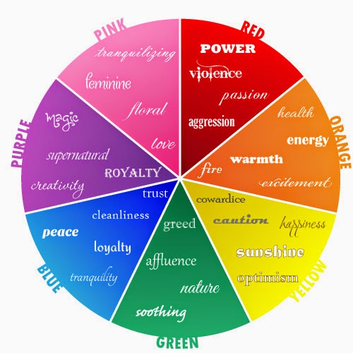


http://www.creativebloq.com/logo-design/choose-colours-8133973

I don't usually think too much about colour when creating artwork. Usually I try and picture what would work and go for it without over thinking it. It's a very useful thing to be aware of, though.  The following descriptions of colours is from a website I found; http://www.moosepeterson.com, which is actually a website giving advice about wildlife photography. There is a page about colour psychology, which I found to be very useful for the consideration of colour to evoke certain feelings.


"Yellow - is the most visible color and is the first color the human eye notices! Yellow, the color nearest to "light" leaves a warm and satisfying impression, lively and stimulating and in many cultures symbolizes deity. Dark yellow can be oppressive while light yellow is breezy. Yellow's stimulating nature and high visibility to the eye is the reason why many road signs are bold yellow (contrasted by black text). Yellow birds, flowers and skies are sure to be eye-catchers just because of the way the mind and eye works!
Orange - is a good balance between the passionate red and the "yellow of wisdom." Orange is symbolic of endurance, strength and ambition. It can represent the fire and flame of the sun. Orange is said to also have the cheerful effect of yellow, but is intensified in its closeness to the color red.
Red - is a bold color that commands attention! Red gives the impression of seriousness and dignity, represents heat, fire and rage, it is known to escalate the body's metabolism. Red can also signify passion and love. Red promotes excitement and action. It is a bold color that signifies danger, which is why it's used on stop signs. Using too much red should be done with caution because of its domineering qualities. Red is the most powerful of colors.
Pink - is the most gender specific. Pink represents femininity and has a gentle nature (which is not a bad thing). Pink is associated with sweets like candy and bubble gum. It also symbolizes softness. Because it's so "feminine," use of pinks should be well planned. Pink and blue color combos are most associated with babies, soaps and detergents.
Purple - is a mixture of somber blue and active red. It can represent coolness, mist and shadows. It symbolizes royalty and dignity and can be mournful, yet soft and lonely. Purple is described as an "unquiet color" being mysterious and mystic in a cultural sort of way. A study revealed that purple, the color of mourning among many peoples, meets with disapproval in six Asian countries.
Blue - represents temperature, sky, water and ice. It is the second most powerful color. It obviously represents coolness, mist and shadows. In some applications it can represent peacefulness and calmness. And as pink represents femininity, blue represents masculinity. Blue is often associated with somber emotions like sadness, gloom and fear. Blue is a contemplative color, meaning intelligence and strength. It is one of the most politically correct colors there is with no negative connotations of it anywhere on the globe.
Green - is the most restful color for the human eye. It's the universal color of nature as well as represents fertility, rebirth and freedom. (That answers the question why it's the best background for birds.) Bright green can be uplifting while dark green evokes a mental picture of a pine forest. Street signs are painted a metallic green background contrasted with white letters because the combination is believed to be the easiest to read and recognize for the human brain. However, as with most colors, green also brings forth some negative connotations. The phrase "green with envy" also gives way to guilt, ghastliness, sickness and disease.
Brown - is associated with nature, trees and wood. It represents conservancy and humility. Next to gray, brown, in one of its many shades, is one of the most neutral of the colors. It is useful in balancing out stronger colors, and because it is one of the most predominant hues in nature, it gives a sense of familiarity. Light brown confers genuineness while dark brown is reminiscent of fine wood and leather.
Gray - gives the stamp of exclusivity. It's the color "around which creative people are most creative." Gray is a neutral color that can enhance and intensify any other color it surrounds. It can enhance the psychological response of the other colors it supports.
Black - is associated with elegance and class (black-tie affair). It is the traditional color of fear, death and mourning. Look at the many terms using the word black to understand how it is perceived: "black sheep," "black heart," "black and blue" and "black mark." Despite the negative imagery that black brings, it is a preferred color in many designs since it contrasts with most colors quite well. If used correctly, it promotes distinction and clarity in your images.
White - symbolizes purity, innocence and birth. It's closely associated with winter and can also represent surrender or truth. In the color spectrum, white is the union of all the colors. Its neutrality and conservative nature is widely accepted. Its simplicity and subtle quality makes it an ideal color for establishing clarity and contrast in your images."
                                                                               http://www.moosepeterson.com/techtips/color.html

Although some of these may seem obvious, it is not always a good idea to use obvious colours to express the obvious emotion. Sometimes less is more and too much of a colour can take away something from the artwork. I have done some of my own colour experiments below:


I did a few warm quick warm up drawings in order to experimenting with layering up colours. I chose some animals that would normally be simple colours and decided to use some colouring pens I had to draw them. I challenged myself to use evry colour pen I had for each animal (orange, blue, purple and green)


This was a fun and useful experiment. I don't usually work in this way, focusing on building up with colour first. It made me think about the light and dark tones and which colour work best for light and dark.  In this instance, colour wasn't being used to convey an emotion but as a tool to build up the drawings without a solid colour outsline.
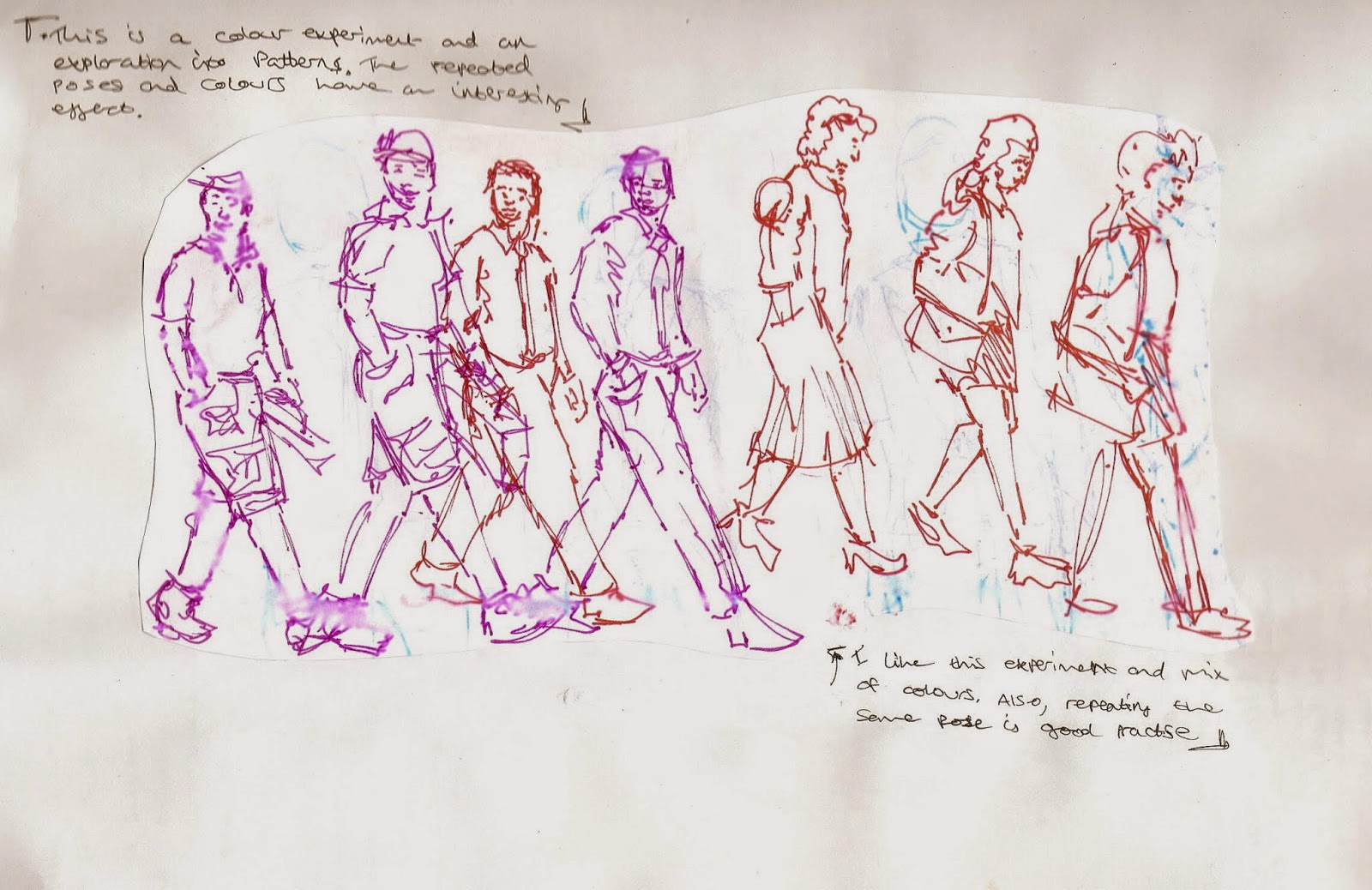


These are part of my observational drawings studying the human form and body language


Experimenting with colour to convey an emotion


The facial expression in the drawing shows an obvious emotion. Yet the colour variations effect the emphasis of that emotion. 


This is part of my sequential experiment that I have put into colour. I tried to colour everything roughly the colour it would actually be.  It looks quite nice but I prefer it in black and white. Black and white leaves room for the imagination and more freedom to interpret it based on your own understanding.  The colours I used were quite bright and didn't do anything for the subject matter. 


Colour experiment


This is page one from my final edit for my sequential experiment for conveying emotion. I used Photoshop to change the contrast and style.  I added a slight blue tinge as I learnt before that blue can make it appear to be night time. Which I didn't really want but decided it would add a slightly eerie feeling.  I think that conveying emotion through a narrative can be very powerful and there can be more of an emotional connection between viewer and subject. But building up an emotion is different to an in your face stand alone piece which can still be incredibly powerful.


 This is page 2.  Using Photoshop I created a blurry 'oil painting' effect towards the end of my sequential piece. This is supposed to symbolise her fear and fading connection with reality.


Patterns, surreal elements and artist research


As part of my research into using surrealism to convey a mood/emotion I am also looking into decorative work and patterns.  This is because this will give me some ideas about different abstract shapes and combinations of shapes.  I visited Wye Vally Butterfly gardens in Symonds Yat and Cambridge Botanical Gardens, in order to observe some shapes and patterns that occur in nature. Below are some of the photos I took and some research drawings and notes.
  

Cambridge Botanical Gardens 


Wye Valley Butterfly Gardens  


Visual Notes


I tried to focus of the patterns on the butterfly wings and explore them in more detail. I used different colours which instantly made the patterns look less natural but you can stil tell there are elements of the patterns taken from nature. This is what is useful to my idea generation for surreal artwork.


This butterfly doesn't have much of a pattern but I thought it was interesting how its wings were clear with and black outline. This is hard to convey through drawing unless you use a detailed background.


These are pages from one of my sketchbooks. The page on the right shows some work and notes about a french illustrator I found on the networking site Instagram.  She goes by the name Lydianeka andI really like her work, but it is really hard to find information about her. Although I found her flickr accoutn where you can view some of her work https://www.flickr.com/photos/103049104@N07/11931090255/ I think her work is purely decorative and she mainly designs tattoos. Although her aims are different to mine I really like all the different aspects of her work and the busy-ness of it.  I want to incorporate some of her style into my own work in terms of the layout and her use of different shapes, animals, faces and objects all combining into a beautiful piece of artwork.  I have considered using my work with close up faces and combining it with her style of decorative art to make an overall piece that conveys an emotion.


These are some more examples of Lydianekas' work with an ink background I created. I also like her use of colour. The way they work together is fun and quirky. She usually uses pinks, blues, yellows and greens.


This is a piece I did inspired by Lydianekas' work.  I tried to convey that the girl is lonely and imagining the things around her. The busy-ness of the piece and wide range of colours are elements I got from Lydianekas' work. The girl is in grey to emphasise her loneliness and separation from everything else. 


I tried a little experiment in my patterns sketchbook. I decided to mix and match the photos of flowers with the photos of butterflies to see what I could create. I thought the plants already looked a bit like birds and the shape on one of the butterfly wings looks a bit like an eyes. So I combined the two to create acreature. This was useful to my research project to explore shapes and to come up with something surreal.


I created this from a workshop we did at University. We were given a selection of patterned paper and had to create somthing using the patterns to create different tones. I created this face as a lot of my research project has involved faces. I find it quite hard to think in terms of tone as I am so used to working using an outline. It was useful to focus more on the shadows and hilighted features instead of the outline first but I still ended up drawing an outline. 


I did another experiment similar to the one above. I tried to create an eye using different parts of the photos I'd taken. This meant I had to focus on colour, tone and the different shapes.


This is something I did as a fun combination of everything. I considered Lydianekas' work and tried to include a lot of things and think about composition.


It was useful to explore patterns in nature and consider creating surreal work. I'm not sure if patterns will make their way into my final piece yet but I still want to experiment with expressing a theme through surrealism and patterns to see if I can get the results I want.

Experiment with different styles and anthropomorphism


I experimented with different styles by replicating the same drawings in different ways. This was to see how much style effects the look of a piece and how style effects communication objectives.  


This is my main character from one of the panels from my sequential illustration.  I experimented with simple styles and more detailed styles. 

I found that the more detailed styles definitely worked better for conveying emotion as you can add more information with the detail and therefore better inform the viewer of how a character is feeling. This all depends, though. There are simple styles that are very powerful. the second image up is a style that I think is more suited to 'how to' leaflets and is not a good style to portray emotions as it seems flat and loses depth. Whereas the first drawing on this post (blue and red) is quite intriguing and still shows a lot of emotion, despite not being as detailed as the one below it. I think it's something to do with the looser lines of the features. 

Anthropomorphism


I experimented a bit with anthropomorphism. It was quite a random experiment, I used my sequential work and added a tiger head. I used photos so obviously it was near impossible to get the right facial expressions. It was quite fun but not took away from the meaning of the piece. I think anthropomorphism can be good for expressing an emotion if used as a symbol and/or if a specific animal is used for a specific reason.


Facial expressions


Below are a variation of different styles and examples of different facial expressions. Along with body language, I feel this is one of the main ways we can physically convey emotion.  It was fun to try to capture different emotions and also a useful excersise to practise with line and movements of the face. I think this excersise also helped me to really explore and capture personality when drawing people. This is something I have struggled with. Sometimes drawing people can be difficult and al lot of my drawings will look generic, instead of like individual people with individual personalities. This practise with movement and the different shapes faces can make has definitely helped me capture different personalities and physical traits. Which is an unexpected bonus.


I started off by drawing some generic faces, focusing on the different aspects of each face that change the overall expression.


As a warm up to this excersise I told my boyfriend to pull various funny faces so I could draw them. It was a fun start and actually really useful in helping me to understand the physical elements and movements of faces. I'd usually worry too much about proportion and lining everything up. Whereas drawing funny faces gave me more freedom to explore what works and what doesn't.

I then did the same with my own face in order to practise masculine and feminine features.


I also tried to draw some quick faces. For most of these I haven't used visual reference in order to see where I'm at with my knowledge of facial features.


This is a page from my sketchbook. There where some interesting faces on Pinterest that I found whilst browesing for research and I drew a few of them in styles I felt suited the emotion. I actually really enjoy capturing emotion in close up photos. I think it's because there is always someone out there who will recognise that emotion and the work will appeal to them. It seems like quite a personal thing to draw someones face up close when they are expressing an emotion physically. I think it is so powerful as it is something we would usually see so close up. People tend to turn away or keep their emotions in their heads to some extent. So I think it is a meanigful thing that evokes a lot of empathy.


This is also a page from my sketchbook with the same aim as the page above. It's surprising how much faces can vary. Not only by ages and gender but also by the expression that is being made.


I've started to really enjoy drawijng older people. I think there is a lot of life in their faces and for a drawing it makes it easy to convey so much emotion and life. Every line and feature is made more interesting by the expression they are making too.


I tend to not use a wide variety of media, but even just using a biro instead of fine liner pen for this drawing made a diffeence. I found it easier to draw in but prefer the result of using a fine liner or dip pen and ink. The edges are thicker with biro and it's nice for softer tones but over all I prefer the darker line you get with ink or fineliner.

Seeing as I was experimenting a lot with older faces I decided to draw a really young face too. This was also a commision for a friend.  It is interesting to compare the techniques used to convey an emotion with an older face and a younger face. Despite all the extra elements I actually find it easier to draw old faces. The older faces are so unique. It's a bit more of a struggle to capture the individuality of a very young child. But a good challenge in focusing on the finer detail and individual aspects.


Monday, 3 February 2014

Salvador Dali (research into surrealism and the mind)

As my research project is based on emotions, I have considered experimenting with surreal elements to convey what is happening in the mind. As it is based on the mind, we can imagine anything, and there are no limits. Much of Dali's work is very surreal and also takes inspiration from the mind. It is interesting to look further into the meaning behind some of his work.

''Much of Dali's work with his own identity took place within the surrealist movement, which he joined in 1929. Surrealism rejected the pragmatic, rationalist approach to life and art and initially basing it's ideas on Sigmund Freud's work on the unconscious, sought to revalue the dream and the imagination as central rather than marginal to human thought.  Through their writings, poetry, the visual arts and in other ways, the surrealists blurred the boundaries between the rational and irrational, reality and fantasy, objective and subjective. Dali was welcomed as a powerful new imagination: 'It is perhaps with Dali that the windows of the mind are opened fully wide for the first time,' proclaimed Andre Breton, the movement's leader, in his preface to the painter's first Paris exhibition in 1929.''

                                  'Salvador Dali A Mythology.' Dawn Ades (Author) and Fiona Bradley (Author), Tate Publishing (1st April 1999)


This paragraph is from the Introduction to the book mentioned above and adequately describes the relation between surrealism and the mind.  It is interesting that surrealism was initially based on Freud's work on the unconscious mind. Surrealism was never intended to be completely random but to delve into the human subconscious and express feeling and emotion without the limitations of realism.  In relation to my work I am interested in Dali's paranoiac-critical method. This is a surrealist technique that was developed by Dali in 1930. One of Dali's paintings he created using this method is 'Metamorphosis of Narcissus 1937'.  The story of Narcissus originates from Greek Mythology where Narcissus, a young beauty who broke many hearts, fell in love with his own reflection in a pool of water. He could never have his love and the Gods turned him into a flower as a result.

Metamorphosis of Narcissus - Salvador Dali  (1937) - Oil on Canvas
The painting above depicts Narcissus in a pool of water, infatuated with his own reflection. In the background you can see how Narcissus used to be before he saw his own reflection.  The stone hand holding an egg and a flower convey what the God's turned Narcissus into. This painting is incredibly surreal and is like two paintings alongside each other. This painting depicts Narcissistic Personality disorder.It is interesting to look into surrealist methods used to portray personality disorders. I think surrealism is a good way to portray mental health issues because it has no limitations and can express certain feelings and emotions that are within the mind and the way we think instead of just from the reality around us.  Dali's Metamorphosis of Narcissus is a powerful painting that adequately conveys the length of time Narcissus gets consumed by his own reflection by turning into stone.  The painting is clever because the stone hand is the same shape as Narcissus' body.

Dali wrote the accompanying poem:


Narcissus,
in his immobility,
absorbed by his reflection with the digestive slowness of carnivorous plants,
becomes invisible.
There remains of him only the hallucinatingly white oval of his head,
his head again more tender,
his head, chrysalis of hidden biological designs,
his head held up by the tips of the water's fingers,
at the tips of the fingers
of the insensate hand,
of the terrible hand,
of the mortal hand
of his own reflection.
When that head slits
when that head splits
when that head bursts,
it will be the flower,
the new Narcissus,
Gala - my Narcissus
 Another artist to paint Narcissus was Caravaggio during the baroque art movement. He used an entirely different approach. These are quite good examples of what effect using different styles has on the subject matter. I would normally thinnk that realism would convey something better as it would make something feel more'real'. But in this case I feel Dali's interpretation is more powerful. I'm not sure why. Possibly because it shows the consequence for Narcissus. He and the stone hand seem sturdy and grand and it is quite powerful that he becomes the stone. The composition and facial expression ini Carravagios painting are very powerful, though. Narcissus is conveyed as a young boy and seems more vulnerable.

Narcissus (1599) Michelangelo Merisi da Caravaggio - Oil on Canvas


References:

Books:

Salvador Dali A Mythology.' Dawn Ades (Author) and Fiona Bradley (Author), Tate Publishing (1st April 1999)


Websites:

https://www.tate.org.uk/art/artworks/dali-metamorphosis-of-narcissus-t02343

http://en.wikipedia.org/wiki/Metamorphosis_of_Narcissus

http://www.artble.com/artists/caravaggio/paintings/narcissus

Other experiments with conveying emotion


The Lone Cosmonaut


     A friend of mine who studies media in Newport asked me to sketch out an idea for his final major project for a film he is making called 'Lone Cosmonaut'. This film is about a cosmonaut who is stuck in space and in the sketch below he is imagining his wife.  I felt this is relevant to my research project as it shows emotion and surrealism, hopefully I captured the right emotion in her face and the poses. These are the rough sketches. I will use Photoshop to put the figures onto a space background and make it look as though they are floating through space.


Lone Cosmonaut sketch. Pencil - Sophie Bishop

Lone Cosmonaut. Watercolour - Sophie Bishop


Photoshop edit


     The sketch below is one I did during a workshop at uni where we had to imagine we worked for a magazine, choose a quote and design an image to suit the style of the magazine. The idea was to use an 'in your face' style.  The magazine was one that uses controversial art and tackles relevant issues within society. I chose the quote 'teach my son how to use a gun' and went for the most extreme version of that quote that I could think of. This was a useful workshop that helped me to think about pushing the boundaries and produce work that is outside of my comfort zone. This is useful to my research project as I want to evoke emotion with my work, whether it be good or bad. I hope to offer an insight into mental health issues and want to learn to work with a more 'in your face' style in order to achieve this effectively.

Teach my son to use a gun. Workshop. Pencil. - Sophie Bishop